The Spread of COVID-19 in Belgium: a Municipality-Level Analysis
-
-
-
-
P. Verwimp
Philip Verwimp, ECARES, ULB
Email: Philip.verwimp@ulb.ac.be
July 8, 2020
Abstract
In this contribution I analyse socio-economic and demographic correlates of the spread of the COVID-19 epidemic across Belgian municipalities. I am interested in the onset of the epidemic, its intensity early on as well as the growth of contaminations in April. The paper uses contamination data from Sciensano, the Belgian health agency in charge of epidemiological information. In the period under investigation, March and April 2020, Belgium used a uniform and restrictive test policy for COVID-19, which changed on May 4th. The data are completed with socio-economic and demographic data published by governmental agencies. Employing linear and log-linear models I find that COVID-19 spread faster in larger, more densely populated, higher income municipalities with more elderly people and a larger share of the elderly population residing in care homes. Richer municipalities managed to slow down the epidemic in April more compared to poorer ones. Municipalities which were more exposed to migration, foreign travel for business, leisure or family affairs were affected earlier on in the epidemic. Income correlates with the contamination rate in particular in the Flemish Region whereas the share of foreign nationalities correlates with the contamination rate in particular in the Walloon Region.
Key words: COVID-19, Belgium, municipality, regression analysis
Note: Ilaria Natali, Francois Ryckx and Jan Van Bavel provided useful comments to an early draft of the paper. All responsibility for remaining errors rest with the author only.
Introduction
COVID -19 does not stop at national of municipality bounderies. Nevertheless, once a country goes into lockdown, the spread of the virus across national or municipality bounderies decreases and a large part of the new cases occurs from a positive case within the municipality. In this paper I want to investigate how the spread of COVID-19 correlates with characteristics of a municipality such as the wealth/poverty of its citizens, population density, the age structure of the population as well as the exposure of the municipality to international migration and business relationships. I am interested in the onset of the epidemic, its intensity early on as well as its evolution towards the end of the lockdown.
Desmet and Wacziarg (2020) find substantial spatial heterogeneity across US counties. They use population density, modes of transportation, housing arrangements, the age distribution, health conditions, among other variables. At any point in time, they write, locations will continue to differ according to these characteristics. They will differ no matter the number of days since onset of the epidemic, and the dfferences will persist, perhaps even increase over time. This provides a foundation for policies that are sensitive to local specicities, where less affected places can have less stringent lockdowns or earlier reopenings. That same rationale applies to study the Belgian case.
I am taking the period March 31 till May 4 as the period under investigation for the following two reasons: First, Sciensano, the data provider, has released contamination data on a municipality level in March only when, on a given day, the number is at least five. In practice, only larger municipalities and cities make that threshold in the course of March. For smaller municipalities we have to wait till March 31 as the first day at which Sciensano realised cumulative contamination data. Of the 581 Belgium municipalities only 205 reached the threshold in March of at least 5 cases on a given day. This paper proposes a method to date the onset of the epidemic in the other muncipalities in the absence of Sciensano start date data. And second, Belgium went into lockdown from March 13 to May 4th, meaning that during this period, the same set of rules applied to the entire territory, including police enforcement as well as testing for potential cases. The latter is important for this paper as local-level discretion on testing would mean that one would find more cases (mostly mild cases) in municipalities with very broad testing and very few cases in municipalities with very low testing. That did not occur, because the testing policy during this period was nationwide the same and it was very conservative due to the absence of testing reagentia.
Recently, the team of Piet Maes (Rega Institute, KU Leuven) released >250 sequences of the virus deposited in the GISAID database. This data set represents a unique opportunity to investigate the dispersal history and dynamic of SARS-CoV-2 in Belgium: origin of introductions into the Belgian territory, relative importance of external introductions in establishing Belgian clusters of transmission, spatio-temporal distribution of these clusters, etc. Two main conclusions arise from his work so far: (i) the importance of external introduction in a municipality, (ii) the clusters resulting from these introductions are widely distributed across the country. In future work, they want to assess if this pattern evolves with the inclusion of more sequences sampled during the lockdown. These analyses are based on sequences available on the 7th April, but in the future, they will update these analyses with newly available sequences. I refer to https://spell.ulb.be/news/covid19_analyses/ for his work.
Belgium comes forward as one of the countries with the highest spatial density of sequenced SARS-CoV-2 genomes. At the global scale, his analysis confirms the importance of external introduction events in establishing transmission chains in the country. At the country scale, the spatially-explicit phylogeographic analyses highlight a global impact of the national lockdown on the dispersal velocity of viral lineages. The dispersal velocity of viral lineages was 5.4 km a day before the lockdown and 1.2 km a day in the first few weeks of the lockdown (see Dellicour et al, 2020).1
In this paper, I use linear and log-linear models. The latter capture the exponential growth of contaminations very well, but results are often similar to the linear model, in particular when we take the lagged dependent variable into account. The contribution of this paper is to obtain a better understanding of the effect of the socio-economic and demographic variables at the municipality level, apart from the inclusion of the lagged dependent variable.
I will use this research to situate the date at which the epidemic entered a municipality in the absence of Sciensano data. I will do that in the next section. Afterwards I explain the hypotheses that I wish to test in this paper, present the estimation strategy and then the results. I use several graphs to illustrate the findings.
Description
Onset of the epidemic
Let us first consider the start of the epidemic in each municipality. The data obtained from Sciensano inform us about the first date a municipality reaches the threshold of at least 5 positive cases, these are cases where the contamination is confirmed in the laboratory. Sciensano does not reveal the number of cases on a given day in a give municipality when this figure is below 5. Correspondance between the author and Sciensano reveals that they refuse to do this for privacy reasons, stating that they want to avoid that contaminated persons can be identified in the community. From the 581 municipalities we have the exact date of the start of the epidemic, defined here as at least 5 confirmed contaminations for 309 municipalities of which 205 reached that threshold in March and 104 in April. For the remaining 272 municipalities Sciensano published the accumulated number of contaminated cases on March 31. If example given, a municipality had 9 contaminated cases by March 31, but never reached the threshold of 5 on a given day (eg. two on March 23; three on March 25 and four on March 30), then we only see in the data that this municipality has accumulated 9 cases by March 31.
On Graph 1, in order to use the figures for all 581 municipalities, I use two methods to inpute the earliest date the epidemic started in those 272 which remained under the 5 cases threshold during the month of March. The first method, resulting in the solid black line in the graph, depicts the start date for the 309 municipalities with known start date. And it uses the average date per district among the 205 municipalities with a start date in March in the following way: a district in Belgium is known as the “arrondissement” and is the administrative level between a municipality and a province. There are 43 districts in Belgium with an average of 13 municipalities each. In this first method I use the municipalities with known dates in March and average these dates per district. I then assign that average date to each of the municipalities in that district that remained under the 5 cases threshold but was listed by Sceiensano with its cumulative cases on March 31. This makes sense for two reasons: (i) we know these 272 municapilities registered their first case somewhere in March, thereby remaining under the Sciensano publication and privacy threshold of 5 cases per day; (ii) contaminations spread through proximity between persons. Maes and Dellicour (2020), who researched the genoom of the virus in Belgium, found that it travelled 5.4 km per day before the lockdown in Belgium (March 13) and 1.2 km per day during the lockdown. Hence it is not farfetched to assume that people living in a municipality are first contaminated by infected persons from their own municipality but in a matter of days also from infected persons from a neighbouring municipality (municipalities in Belgium rarely are more than 10km wide). The results of this method is that it moves the onset of the epidemic in these 272 municipalities to March 24 on average, rather than March 31. 2
The data reporting strategy of Sciensano (protecting privacy) allows municipalities with a smaller population to remain under the radar as larger municipalities reach the 5 cases per day threshold much easier. This can be seen from the population size in the 205 municipalities with known start day, which is on average 37,000 people. For the 272 municipalities with accumulated contamination count available on March 31 only, the population size is on average only 13,000. The method above can thus be regarded as a correction to put smaller municipalities also on the radar.
The second method, resulting in the red dashed line in Graph 1, deals with one shortcoming of the first method, to wit that in a few districts the average can be based on only one or a few municipalities with more than 5 registered cases before March 31. In an extreme example of only 1 municipality with more than 5 registered cases before March 31, method one assigns its date to all other municipalities in that district (provided of course these other municipalities have more than 5 cases by March 31, otherwise they will turn up only in April).3 To account for that I use a second method in which I subtract the number of municipalities with known dates from 31. Thus, example given, if in a district of 15 municipalities 6 reached the 5 cases threshold in the course of March, 4 reached that threshold in April and 5 have accumulated more than 5 cases by March 31, then I inpute 31-6=25 as the date in March at which the epidemic started in these 5 municipalities which feature under “March 31” in the Sciensano data . The logic is akin to method 1 above and follows the findings of Maes and Dellicour (2020): if you are surrounded by many municpalities in your district that reached the 5 cases threshold in the course of March, then you are more likely to register cases yourself prior to March 31. And, in contrast, if you are not surrounded or only a few municipalities in your district have reached the threshold, then your start date will not be far from March 31. Using this second method I arrive at March 25 on average as the start date for these 272 cases, only 1 day more compared to method 1.
To summarize, Graph 1 shows the onset of the epidemic for all belgian municipalities, in a kernel density estimate, whereby the exact Sciensano startdate is used for 309 municipalities, because they reached the threshold of at least 5 cases on a given day. For the remaining 272 municipalities we know that they accumulated at least 5 cases by March 31. Their start date is thus earlier and is advanced by 5 to 6 days on average depending on method 1 or 2 above.
Graph 1
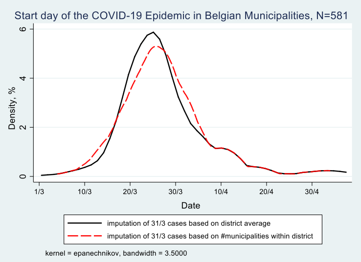
We derive from Graph 1 that most municipalities registered their first set of contaminations between March 15 and March 30, hence in the first two weeks of the lockdown in Belgium, 70% of them to be exact, with 4% of municipalities before March 15 and 26% after March 30. This does not mean that the persons testing positive have contracted the virus during the lockdown. Given that the incubation period is on average 10 days and that only persons with symptoms were tested in the period under investigation (March 1 to May 4), it may well be that these persons contracted it prior to the lockdown.
Intensity of the epidemic on March 31
Moving the description to the intensity of the epidemic, defined as the number of registered contaminations by a given date. The earliest date at which we have accumulated contamination data from Sciensano is March 31. This allows us to study the total number of registered contaminated cases for all belgian municipalities on March 31. By that date Belgium registered 12,300 cases. This figure is an undercount as there are 105 municipalities that will only reach the 5 cases threshold in the course of April, hence they may have registered a few cases by March 31. By May 4 - the end of our period under study - the total count for registered contaminations in Belgium will be 50,000. Thus the total count on March 31 gives us an idea of the intensity of the epidemic at the municipality level at a relatively early stage in the epidemic, in any case before the “high point” of the epidemic, defined at the date at which the number of new contaminations is lower then the day before (or lower then the average of the last few days). This turning point in the epidemic in Belgium is situated around mid-April. The number of contaminations registered by March 31 tells us how many people contracted the virus before the lockdown and in the first few days of the lockdown (give that the average incubation period is 10 days). Map 1 presents the contamination rate per 1000 inhabitants on March 31.
Map 1: Number of registered contaminations per 1000 inhabitants on March 31, 2020
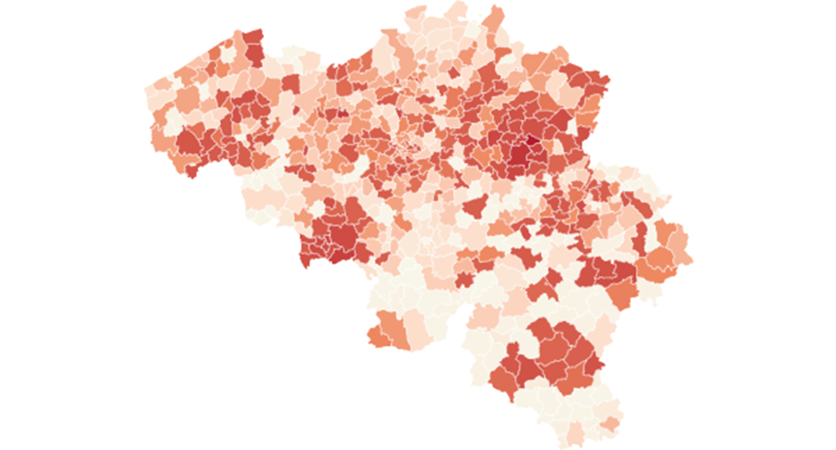
Legend, quartiles: 0 to 0.5 0.5 to 1 1 to 1.5 , +1.5
The map shows a number of clusters with a high contamination rate, notably around two flemish cities, Sint-Truiden in southern Limburg and Kortrijk in the west of the country as well as two clusters in Wallonia, one around the city of Mons in the south-eastern part and in south of the country around the city of Arlon. In general the flemish region is more affected then the walloon region, with more municipalities in the north having darker color, meaning more contaminations per 1000 inhabitants compared to the south.
Growth of contaminations in the month of April
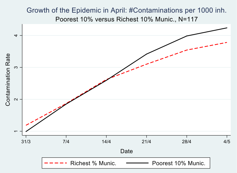
The number of registered contaminations in Belgium grew from 12,500 on March 31 to 50,000 on May 4. Graph 2 depicts poor and rich municipalities. It shows the growth of contaminations, expressed as the change in contaminations per 1000 inhabitants during the month of April, meaning between the first date that we have accumulated contamination data per municipality from Sciensano (March 31) and the end of the strict lockdown (May 4). It is clear from the graph that the richest municipalities started with a disadvantage, meaning they have more registered contaminations per 1000 inhabitants compared to the poorest municipalities, 1/1000 versus 1.2/1000 to be precise on March 31.
Following the evolution of the epidemic in the month of April, on a weekly basis, which is possible with the Sciensano data, we see that by April 14th, the richest municipalities are doing better than the poorest ones, meaning they have turned the disadvantage of the early and intensive hit into an advantage, i.e less contaminations per 1000 inhabitants. Most likely this is because the population in these rich municipalities is better able to isolate itselve from fellow citizens, in the sense that they have jobs where they can work at home, a house with a garden that they do not have to share, a car which allows them to avoid public transport and so on. We come back to this in the analysis part of this paper.
The difference between 31/3 and 4/5 on the one hand, and between rich and poor municipalities on the other hand, is statistically significant at the 5% level, as can be seen in table 1. At the end of the observation period (May 4), this difference amounts to .65 cases per 1000 inhabitants. For a municipality in the poorest decile, of, on average 35,000 inhabitants, this accounts for a difference of 22 more persons contaminated compared to a municipality in the richest decile. Multiply that figure 58 times for all municipalities in this poorest decile and one obtains a difference of 1,276 more contaminated persons compared with the richest decile.
Table 1: Difference-in-Differences, #registered contaminations per 1000 inhabitants in the course of the month of April, by poorest and richest decile, N==117
| Week | March 31 | May 4 | Difference |
|---|---|---|---|
| Income decile | |||
| Poorest | 0.99 | 4.24 | 3.25*** |
| Richest | 1.18 | 3.78 | 2.60*** |
| Difference | 0.19* | 0.46 | 0.65** |
Graph 2
This finding resonates with Bartsher et al (2020) who exploit within-country variation in the spread of COVID-19 and in social capital (proxied by voter turnout) in seven european countries and they find that find fewer accumulated cases of the virus on areas of high social capital.
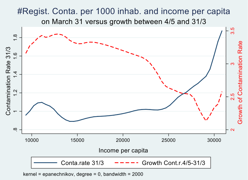
We can also look at the entire income distribution over all municipalities and visualise the effect of income on the growth trajectory of the epidemic by comparing the contamination rate on March 31 with that at the end of the observation period (May 4). We notice that the initial disadvantage (early contaminations) and later advantage (slower growth of the rate of contaminations) kicks in at around 20,000 euro per capita per year. Around 30% of Belgian municipalities have more than 20,000 euro per capita income in 2018 according to fiscal data.
Graph 3
Analysis
Several factors can influence the onset, the intensity early on and the growth of the COVID-19 epidemic in a given municipality. Research on the genoom of the virus in Belgium had discovered that not one but multiple strands of the virus have been introduced in Belgium, meaning there is not one person ‘zero’ who introduced the virus in Belgium but there are multiple ones that introduced it independently of each other. Virologists distinguish three types A, B and C, each following a different trajectory accross the globe. There are three well-known cases at the very start of the epidemic in Belgium: (i) the first person with contamination demonstrated in the laboratory was a businessman returning from Wuhan in China, (ii) the second was a business women returning from a business trip in France and other countries, and (iii) was a group of 13 friends and family who returned from a ski holiday from the same hotel in northern Italy.
All three contracted the virus while travelling abroad, with business trips and ski holidays linked to the richer part of the population. At the same time, once the virus was present in the municipality and the country went into lockdown, richer municipalities may have been better able to limit the spread of the virus, for reasons mentioned above. This allows us to derive the following hypotheses that will be put to the test with the data:
(1a) “The virus was earlier introduced in richer municipalities”
(1b) “Richer municipalities were bette able to limit the spread of the virus”
From an inspection of Map 1 it seems that there are three clusters of contaminations close to the French border, notably around the cities of Kortrijk, Mons and Arlon. Ginsburgh et al (2020) show that the northern part of France, bordering Belgium, has the highest death toll in France outside of Paris. Municipalities with a lot of cross-border labour and consumer migration may bring the virus home to their own municipalities. This may also have been the case with municipalities on the border with The Netherlands, Germany and Luxemburg. The city of Tilburg in the south of the Netherlands for example was the site of a major, early, outbreak.
On a global scale, the virus had several clusters of outbreaks before it arrived in Belgium via travellers, notably Wuhan in China and northern Italy. In the first weeks of March it was standard belgian policy not to test travellers who returned from business or holiday abroad when upon return they did not have any symptoms. The group of 13 friends and family for example needed to insist being tested because their holiday hotel was considered outside of the contaminated zone. Once the virus is introduced in the municipality the role of travellers, be them belgians, migrants or foreign residents returning to Belgium from visiting family or friends, may become less important for the subsequent evolution of the epidemic as the virus does not distinguish between nationalities. This leads to the second set hypotheses:
(2a) “Municipalities closer to a border had an earlier onset”
(2b) “Municipalities with more foreign nationalities had an early onset”
(2c) “The presence of foreign nationals does not play a role after the initial start”
There are also two variables whose likely effect is “obvious”, that is population size and population density. Municipalities inhabiting more people have defacto a larger probability to start the epidemic early, and given that contamination occurs trough close encounters with fellow citizens, population density is likely to play a role once the virus has been introduced in the municipality. This allows us to derive the next hypotheses:
(3a) “More populated municipalities had an early onset of the epidemic”
(3b) “More densily populated municipalities had a stronger growth of the epidemic“
The age-structure of the population and the size of households may also play an important role in the spread of epidemic. Elderly citizens are much more at risk, in particular when one considers the mortality risk, which we do not consider in this paper (Barnett and Grabowskoi, 2020). It is also well-known that the virus hit care homes very hard. Once the virus is introduced in a care home, via visitors or via a staff member, a large percentage of residents and staff may get infected. In addition, many people contract the virus via an infected household member. This leads us to the following three hypotheses:
(4a) “Municipalities with a larger share of elderly citizens had a faster growth”
(4b) “Municipalities with a larger share of their elderly population residing in care homes have a higher contamination rate”
(4c) “Municipalities with a larger share of singleton households had slower growth”
Belgium being a federal country with three entities that have their own socio-demographic and economic characteristics governed by regional public authorities next to the federal level, which may have its own effect on the epidemic, leading to the following hypothesis:
(5) “The location of a municipality in one of the three regions of the country, the Brussels Capital Region, The Flemish Region and the Walloon Region may effect the start day, the intensity early on and the growth of the epidemic. It is however likely that the effect of these dummy variables is captures, at least partly, by the socio-economic and demographic variables above.”
We will now take these hypothesis to the data by regressing the start day of the COVID-19 epidemic for each municipality, the intensity on 31/3 as well as the growth of the epidemic on a number of socio-economic and demographic characteristics. In particular, we will test the following equations:
Whereby the dependent variable is the start day of the epidemic (equation 1) or the number of contaminated cases on March 31 (equation 2). Alfa is a constant, X a vector of socio-economic an demographic characteristics, beta the coefficient for each of these characteristics and e the error term.
Our third independent variable, the growth of the epidemic, defined as the cumulative number of contaminations on May 4 minus the cumulative number of contaminations on March 31 will be regressed as follows:
Whereby the dependent variable (Growth_Cases_May_4_March_31) is the change in contaminations between May 4 and March 31. As this is a change (or growth variable), we need to control for the initial value of the dependent variable, to wit the number of contaminations per 1000 inhabitants on March 31 (Cases_31_March). The other independent variables are the same as in equations 1 and 2, with X a vector of socio-economic and demographic characteristics. We also run a regression where we use the weekly observation of the contamination rate. To capture the exponential growth of the contamoinations we also run the model in log-linear form (equation 3b). To enable the transformation to logs, we add +1 to the number of cases (avoiding log 0 resulting in missing values).
As practised in the economic growth literature to deal with potential endogeneity, we will instrument the baseline value of the dependent variable, based on findings from estimating equation 2. Hence, we first estimate equation 2 to determine the initial level of the dependent (Cases_31_March) and then instrument it with one or more variables that affect(s) the growth of the epidemic only through their effect on the intial level. This two-stage estimation is then as follows:
Results
In Table 1 we present the results of our regression analysis for the start day using ordinary least squares. We introduce our variables of interest gradually in order to find out if their impact is or is not affected when we introduce subsequent variables.
Starting with population size and population density it is clear that both have a statistically significant effect on the start date of the epidemic: the higher they are, the earlier the start date. I remind of the definition of ‘start date’ in this paper: the first date at which the municipality has at least 5 registered contaminations on a given day. This was used because of the limitations of the data published by Sciensano. It does not represent the date at which the very first contamination appeared in the municipality. Rather it is a indicator that combines the entry of the virus in a municipality with a first indication of the spread at a very early stage. Our dependent variable is here the number of days after February 29 and its computation was set out earlier in this paper. I use the results of method 1 here. The count for this variable has a minimum of 4 (March 4) and a maximum of 64 (May 3) and its distribution is shown on Graph 1.
The second set of regressors introduced are population composition variables, more in particular the share of population above age 65 and the share of singleton households. As outlined in the hypothesis section the first variable should expedite the date that the 5 cases threshold was reached, whereas the second variable is hypothesized as increasing (or better postponing) the date. Both variables do what they are supposed to do in regression 2 in table 1. Adding average income per capita net of taxes based on fiscal data, I find in regression 3 that richer municipalities were confronted with the virus in their municipality earlier on. The reasons for that have been set-out earlier, in particular business travel and ski-holidays.
In regresssion 4 we add the share of elderly persons that reside in a care home, computed as the number of officially registered and certified beds in care homes devided by the size of the population above age 65. The higher the share, the earlier the onset. While elderly persons are not responsible for the introduction of the virus in the municipality (as compared to business travellers and skiers), they may have spread it without knowing or before they knew they were contaminated. I refer again to the definition of ‘start date’ which does not identify the first day or patient zero, but rather the first five positive cases in a given day. I also refer to the restrictive test policy.
Table 1: the correlates of the onset of the epidemic at the municipality level, OLS
| Dep. Var. | Start date of the COVID-19 Epidemic, in #days after March 1 | |||||
|---|---|---|---|---|---|---|
| R1 | R2 | R3 | R4 | R5 | R6 | |
| Indepen. Var. | ||||||
| Pop.size (‘1000) | -.10*** (.03) |
-.12*** (.04) |
-.12*** (.036) |
-.11*** (.036) |
-.11*** (.032) |
-.10*** (.03) |
| Population density (‘1000) | -.45*** (.17) |
-1.17*** (.23) |
-1.14*** (.22) |
-1.02*** (.22) |
-.54** (.23) |
-.001*** (.0002) |
| % of population +65 of age | -.64*** (.13) |
-.45*** (.15) |
-.37** (.16) |
-.48*** (.16) |
-.48*** (.16) |
|
| % singleton households | .46*** (.10) |
.31*** (.12) |
.27** (.12) |
.30*** (.11) |
.39*** (.13) |
|
| Income per cap. (‘1000) | -.55*** (0.18) |
-.56*** (.17) |
-.40** (.17) |
-.52*** (.19) |
||
| % of pop +65 in care homes | -.25* (.13) |
-.26* (.13) |
-.32** (.13) |
|||
| Municipality at the border | 4.44*** (1.36) |
1.44 (1.45) |
||||
| %Foreign Nationalities | -.20** (0.08) |
|||||
| % French | .27** (.12) |
|||||
| % German | .10 (.17) |
|||||
| % Dutch | .005 (.11) |
|||||
| % Italian | -1.28*** (.19) |
|||||
| % Chinese | -14.3*** (4.26) |
|||||
| Constant | 29.91*** (.64) |
28.79*** (3.21) |
40.42*** (4.80) |
41.41*** (4.79) |
39.89*** (4.59) |
40.36*** (5.21) |
| N | 581 | 581 | 581 | 581 | 581 | 581 |
| R2 | 0.14 | 0.21 | 0.23 | 0.23 | 0.26 | 0.30 |
In regressions 5 and 6, I add variables that capture exposure to foreign contacts. In regression 5 I introduce a binary variable that equals one if the municipality borders a neighbouring country (France, Luxemburg, Germany or the Netherlands) and equals zero otherwise. I expected that the proximity of the border would make these municipalities easy targets to import the virus from across the border. However, the opposite seems to be the case, these municipalities have on average a later start date, more than 4 days later to be precise, an effect that is statistically significant at the 1% level. The second variable I introduce here is the percent of in habitants who do not carry Belgian nationality. A belgian municipality has on average 7.8% inhabitants with non-belgian nationality, varying from 1% in remote rural areas to 48% in a municipality in Brussels. The variable is introduced here for the same reason as the border variable, with the twist that the exposure to the virus does not come form geographical proximity to another country, but rather from personal proximity to family, friends, migration, trade, holiday and travel to and from the country of nationality. I find that higher exposure (measured by a higher share of non-belgians) expedites the spread of the virus.
When we then investigate more carefully for which nationalities in particular exposure matters more than others, we do find a marginally significant effect of the share of persons with French nationality. I remark that the binary border variable now turns statistically insignificant, as its effect is at least partially captured by the newly introduced French variable. Two other variables however have a statistically significant effect at the 1% level, to wit the share of inhabitants with Italian and with Chinese nationality. The share of population in a municipality with Italian nationality varies from 0 to 10% and with chinese nationality from 0 to 1.2%. An increase by 1% in the share of italian inhabitants expedites the date with 1.3 days and we arrive at approximately the same result when increasing the share of chinese in the municipality with 0.1%.
COVID-19 spread from the city of Wuhan in China to the rest of the world and in Europe, the virus set hold in northern Italy before travelling to other places. It could be that Italians or Chinese residing in Belgium or travelling to Belgium to visit family and friends have imported the virus after visiting or residing in Italy or China, but it could also be that Belgians who entertain business, trade, friendship or marital relations with the Italian or Chinese inhabitants of their municipality imported the virus through travelling to either country. And it could be both, as there were multiple introductions of the virus in Belgium, as we discussed above.
Importantly, the effect of the other variables, in terms of the magnitude of the coefficient and its statistical significance does not change very much after the subsequent introduction of additional variables, indicating that each of them has an effect on the dependent variable after controlling for the other variables. The R-squared gradually improves after the introduction of new variables. Overall, the R-squared remains relatively low, meaning that our data are widely dispersed alongside the regression line. High-variability data nevertheless can have a significant trend. The trend indicates that the independent variables still provide information about the start date of the epidemic even though data points fall further from the regression line.
The start date was on average earlier for municipalities located in the Region of Brussels Capital (March 18), then Flanders (March 24) and than Wallonia (March 31). It however does not make much sense to introduce dummy variables for the region in the regression here as they account for part of the variation that we want to capture with the other variables. Rather, upon introduction (not shown) the effect of the population composition variables (density, young and elderly population) disappears, leaving the effect of the other variables intact.
Moving on to our second dependent variable, the contamination rate per 1000 inhabitants on March 31, we find several of the effects presented in Table 1, but with the opposite sign (see Table 2). In the first 5 regressions of Table 2 the effect of the regressors is as expected, with the only difference to Table 1 that the income variable is not statistically significant. Meaning that rigth after the initial introduction of the virus (as presented in table 1) income does not seem to affect the contamination rate on March 31.
In columns 6 and 7, I introduce the start date as an additional regressor. Most likely municipalities where the virus has been introduced earlier have a higher contamination rate on March 31, which is indeed born out by the OLS results in column 6. One may argue that the start date is endogenous to the characteristics of the municipality, which I have indeed demonstrated in Table 1. To that extent I instrument the start date with the share of Italians in the municipality, whereby I assume that the share only effects the contamination rate through its effect on the start date, which indeed seems to be the case here, with the test-statistic for underidentification as well as the F-test pointing in the right direction. Results of the IV are very similar tot he OLS. There is no difference in the magnitude of the coefficient in the OLS and IV regression, nor in its statistical significance.
Next, I discuss the results on the growth of the epidemic in the month of April. These are presented in Table 3. I remind here what is meant by growth: the change in the contamination rate between May 4 and March 31. In our analysis, the inclusion of a lagged dependent variable is obvious because the contamination rate at time t+1 depends on the contamination rate at time t. The relation between the lagged dependent and the dependent variable is modeled here in a linear way. In epidemiological models , their relation may be modeled in a different and more complex way. To capture the exponential growth of contaminations, I also use the log-linear model. Results do not differ much from the linear model.
Lagged dependent variables can account for measurement error, noise and other effects. The question here is should we control only for the baseline value of the contamination rate (meaning on March 31) or should we include weekly lags of the contamination rate? In the first case I am only interested in estimating the growth of the contamination rate over the whole period of the strict lockdown, whereas in the other case I am regressing the contamination rate on a weekly basis. There are two main arguments to guide that discussion.
Table 2: the correlates of the contamination rate on March 31, OLS and IV regression
| Dep. Var. | Contamination rate per 1000 inhabitants on March 31 | ||||||
|---|---|---|---|---|---|---|---|
| R1 | R2 | R3 | R4 | R5 | R6 | R7-IV | |
| Ind. Var. | |||||||
| Start day of epidemic | -.05*** (.004) |
-.05*** (.012) |
|||||
| Pop density (‘1000) | .06*** (.01) |
.06*** (.01) |
.05*** (.01) |
.03** (.017) |
.04*** (.01) |
.01 (.01) |
.007 (.02) |
| % pop +65 | .041*** (.011) |
.042*** (.007) |
.034*** (.012) |
.039*** (.012) |
.041*** (.013) |
.028** (.011) |
.026*** (.010) |
| % singleton households | -.017*** (.006) |
-.015** (.007) |
-.013* (.007) |
-.014** (.007) |
-.023*** (.009) |
-.024*** (.008) |
-.023*** (.006) |
| Income per capita | .006 (.013) |
.006 (.013) |
-.002 (.014) |
-.001 (.015) |
-.02 (.015) |
-.02 (.014) |
|
| %pop+65 in care homes | .017* (.010) |
.017* (.01) |
.018* (.009) |
-.002 (.01) |
-.0003 (.009) |
||
| Border | -.22** (.09) |
-.06 (.10) |
-.0002 (.09) |
||||
| %Foreign Nationalities | .006 (.005) |
||||||
| % French | -.015 (.014) |
-.0008 (.01) |
|||||
| % German | -.014** (.006) |
-.01* (.05) |
|||||
| % Dutch | -.006 (.008) |
-.013** (.007) |
|||||
| % Italian | .05** (.02) |
.-004 (.02) |
|||||
| % Chinese | .88*** (.25) |
-.09 (.45) |
|||||
| Constant | .67*** (.25) |
.54 (.36) |
.49 (.35) |
.60 (.36) |
.73* (.40) |
3.12*** (.45) |
3.03*** (.74) |
| N | 581 | 581 | 581 | 581 | 581 | 581 | 581 |
| R2 | 0.04 | 0.04 | 0.04 | 0.05 | 0.08 | 0.36 | 0.35 |
| Underid. test | 23.63*** | ||||||
| First stage | Start day | ||||||
| % italian | -1.24*** (.23) |
||||||
| F-test | 29.03*** | ||||||
According to Angrist and Pischke (2009), the lagged dependent model should be preferred when the assumption “that the most important omitted variables are time-invariant doesn’t seem plausible”. For this paper it means the extent to which we believe the factors that change during the lockdown, may have contributed to the change in the contamination rate. This reasoning applies to both the inclusion of the 6-week lag and the 1-week lag. If we believe such time-variant factors accors municipalities may have played an important role, than we should prefer the lagged-dependent model with a lag of one week. Since I do not have time-variant regressors to include in the estimation, not at the weekly level nor during the entire period of the lockdown, I do not know how relevant they are. However, we do know that the lockdown was a national (meaning in Belgium the federal level) policy and plausibly applies to all municipalities in the same way. The (federal) Minister of the Interior, Pieter De Crem, who is in charge of te police force issued a decree at the start of the lockdown with clear, uniform instructions for the enforcement of the lockdown regulations.
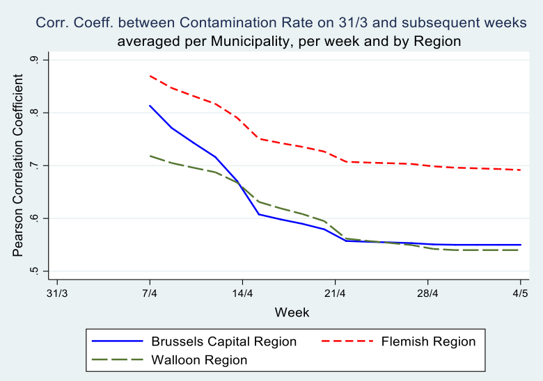
Secondly, McKenzie (2012) argues that, in cases of low autocorrelation of dependent variables, controlling for the lagged dependent variable is more powerful than either employing the difference-in-difference estimator or the single difference estimator. His intuition is that, in cases where baseline data have little predictive power for future outcomes, it is inefficient to fully correct for baseline imbalances. In our data however, the correlation between the contamination rates at the municipality level on March 31 and the subsequent weeks of the epidemic is very high: The Pearson correlation coefficient is \(.80^{}\) after one week and still \(.60^{}\) on May 4th (see Graph 5). Hence, the inclusion of a weekly lagged dependent variable explains a large part of the variation in the dependent variable.
Since both the inclusion of a 6-week lag and a weekly lag may shed ligth on the correlates of the growth of contaminations, I present both models: in Table 3, we control for the baseline value of the dependent variable (the contamination rate on March 31) only in our estimation of the contamination rate on May 4th and in Table 4 we use weekly lags. We include these regressions to find out if the results differ. Results in both tables are very similar.
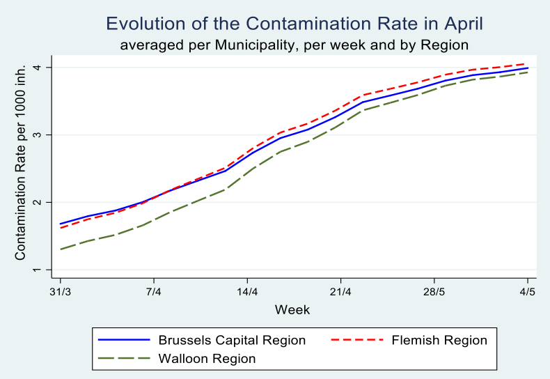
Graph 4
Graph 5
In Table 3, income seems to be more important for the Flemish Region as compared tot he Walloon Region, whereas in the latter the share of the elderly population in care homes as well as the share of inhabitants from neighbouring countries exercise a statistially significant effect.
The most used method in case of lagged dependent variables combined with problems of endogeneity is General Methods of Moments (GMM), the preferred workhorse for dynamic panel data estimation. The Arellano–Bond estimator (1991) sets up a generalized method of moments (GMM) problem in which the model is specified as a system of equations, one per time period, where the instruments applicable to each equation differ (for instance, in later time periods, additional lagged values of the instruments are available). The instruments include suitable lags of the levels of the endogenous variables (which enter the equation in differenced form) as well as the strictly exogenous regressors and any others that may be specified. With the data at hand however, as mentioned earlier, we do not have time-variant covariates, hence we can only use the values of the time-invariant covariates as instruments in a GMM level equation. Past values of those instruments are however the same as current values, making GMM not feasible here, and leading to overidentification problems when executed.
Results of the analysis, presented in Table 3 show that three variables are correlated with the change in contamination rate (apart from the lagged dependent variable of course) across specifications and models: the share of the population above age 65 in a municipality, the average income per capita in the municipality and the share of the population above age 65 residing in a care home. Richer muncipalities manage to slow down the epidemic wheres a higher share of elderly in the municipality and a higher share of elderly residing in care homes accelerate it.
The effects of singleton households and population density disappears once we introduce regional dummies for the Brussels Capital Region, the Flemish and the Walloon Regions, demonstrating that the latter are correlated with these regional effects. In seperate regression per region, these variables no longer turn up in a statistically significant way.
Table 3: the growth of the contamination rate in April, OLS and IV regressions
| Dep.Var | Growth of the Conta. Rate between May 4 and March 31 | |||||
|---|---|---|---|---|---|---|
| Lag is 6 weeks | ||||||
| Log-linear | Linear model | |||||
| R1 | R2 | R3 | R4 | R5 - IV | R5 - IV | |
| Indep. Var. | Belgium | Belgium | Flemish Region |
Walloon Region |
Belgium | Belgium |
| Lagged Conta.Rate | .035*** (.028) |
2.07*** (.16) |
2.46*** (.21) |
1.63*** (.18) |
2.38*** (.68) |
2.14*** (.62) |
| Pop density (‘1000) | -.004 (.01) |
-.01 (.04) |
.23 (.29) |
.28 (.35) |
-.003 (.037) |
-.0003 (.036) |
| % pop +65 | .015* (. 009) |
.06* (. 03) |
.08 (.05) |
.09 (.06) |
.07** (.034) |
07** (.03) |
| % singleton households | -.005 (.006) |
.017 (.025) |
-.05 (.041) |
.06 (.04) |
-.003 (.019) |
-.003 (.019) |
| Income per capita | -.017* (.01) |
-.082** (.040) |
-.18*** (.06) |
.04 (.075) |
-.11*** (.036) |
-.11*** (.036) |
| %p.+65 in care home | .023*** (.007) |
.086*** (.031) |
.047 (.03) |
.11** (.046) |
.07** (.03) |
.07** (.036) |
| Foreign nat. | ||||||
| % French | -.013** (.005) |
-.066** (.027) |
.09 (.16) |
-.08*** (.027) |
||
| % German | -.001 (.004) |
-.02* (.011) |
-.22 (.33) |
-.06*** (.018) |
||
| % Dutch | .009* (.005) |
.044* (.025) |
.022 (.026) |
.72*** (.22) |
||
| % Italian | .028** (.011) |
.028 (.053) |
-.07 (.13) |
.07 (.075) |
||
| % Chinese | .047 (.17) |
-.87 (.76) |
1.06 (1.09) |
-1.75** (.70) |
||
| Regional D. Brus.=base |
||||||
| Flemish | .003 (.10) |
.21 (.47) |
- | - | .51 (.47) |
.49 (.45) |
| Walloon | .18 (.11) |
.98* (.51) |
- | - | 1.2** (.56) |
1.1** (.54) |
| Constant | 1.33** (.31) |
1.12 (1.39) |
4.47*** (1.45) |
-2.12 (2.44) |
1.57 (1.39) |
1.78 (1.35) |
| R2 | 0.32 | 0.41 | 0.50 | 0.39 | ||
| N | 581 | 581 | 300 | 262 | 581 | 581 |
| Underid. test | 13.2*** | 15.0*** | ||||
| Over ident. Sargan stat. |
0.83 (0.36) |
|||||
| First stage | Cont.r. 31/3 |
Cont.r. 31/3 |
||||
| % Italian | -.08*** (.02) |
-.075*** (.02) |
||||
| % Chinese | .56* (.33) |
|||||
| F-test | 12.9*** |
8.20*** |
||||
We have seen earlier on that the share of italian and chinese nationals had a statistically significant effect early on in the epidemic: a higher presence is correlated with an earlier start and a higher contamination rate on March 31. Beyond this initial effect, the share of foreign nationals may also affect the subsequent growth of the epidemic, eg. via the frequency of its interactions within the municipality, as the virus does not discriminate between nationalities. In R2 the italian variable is no longer statistically significant, but it is in the long-linear model in R1. This is one of the few occasions were the models yield a different result.
In order to deal with the endogeneity of the lagged dependent variable we introduce the shares hence as instrumental variables in the linear version of the model in R5 and R6, thereby assuming that they only affect the growth of the epidemic through their impact on the contamination rate of March 31. This makes sense as the country was in lockdown, so one could not anymore cross national borders and import the virus from abroad. The test-statistics (F-test, underidentification test and overidentification test) are all favourable. In R5 and R6 the three variables mentioned above: income per capita, share of population above 65 and share of elderly in care homes are all statistically significant, with similar magnitude as in column 2.
In Table 4 we account for weekly lags of the dependent variable and model the growth of the epidemic in a linear as well as a log-linear way. Results are similar to Table 3 in the sensse that the same variables turn up in a statistically significant manner: share of the elderly population, share of that population residing in care homes and income per capita. The percentage of the population with foreign nationalities proofs statistically significant in these regressions, in particular when analysing the Walloon Region separately.
Table 4: Random effects panel data estimation with 1-week lags
| Dep.Var | Growth of the Contamination Rate between 4/5 and 31/3 with one-week lag | |||||
|---|---|---|---|---|---|---|
| Linear model | Log-linear model | |||||
| R1 | R2 | R3 | R4 | R5 | R6 | |
| Indep. Var. | Belgium | Flemish Region |
Walloon Region |
Belgium | Flemish Region |
Walloon Region |
| Lagged Conta.Rate | 1.*** (.009) |
1.02*** (.01) |
.99*** (.01) |
.68*** (.013) |
.67*** (.017) |
.68*** (.02) |
| Pop density (‘1000) | -.001 (.01) |
-.03 (.05) |
.07 (.07) |
.002 (.004) |
.02 (0.26) |
.06** (.03) |
| % pop +65 | .015** (.006) |
.02** (.009) |
.02 (.01) |
.007** (.003) |
.012** (.005) |
.005 (.007) |
| % singleton households | .001 (.005) |
-.014* (.008) |
.011 (.009) |
-.0002 (.003) |
-.005 (.004) |
-.0007 (.005) |
| Income per capita | -.016** (.007) |
-.03*** (.01) |
.01 (.014) |
-.005 (.004) |
-.017** (.007) |
.006 (.008) |
| %p.+65 in care home | .019*** (.004) |
.01 (.007) |
.025*** (.009) |
.008*** (.003) |
.009** (.004) |
.009** (.004) |
| Foreign nat. | ||||||
| % French | -.014*** (.005) |
.004 (.02) |
-.017*** (.005) |
-.007*** (.002) |
-.0003 (.001) |
-.007** (.003) |
| % German | -.006** (.002) |
-.017 (.05) |
-.014*** (.004) |
-.002 (.003) |
.003 (.03) |
-.005* (.003) |
| % Dutch | .005 (.005) |
.002 (.005) |
.15*** (.04) |
.002 (.002) |
-.0006 (.002) |
.064*** (.017) |
| % Italian | .02** (.009) |
.02 (.026) |
.02 (.014) |
.015*** (.004) |
.026* (.015) |
.012* (.006) |
| % Chinese | -.047 (.12) |
.27 (.19) |
-.23 (.16) |
.053 (.064) |
.068 (.097) |
.09 (.085) |
| Regional D. Brus.=base |
||||||
| Flemish | .02 (.088) |
- | - | -.01 (.04) |
- | - |
| Walloon | .11 (.096) |
- | - | .02 (.04) |
- | - |
| Constant | .42 (.28) |
1.14*** (.30) |
-0.41 (.49) |
.48*** (.13) |
.67*** (.18) |
-.026 (.23) |
| N | 2905 | 1500 | 1310 | 2905 | 1500 | 1310 |
Conclusion
I performed a number of analyses in this paper, which focussed on socio-economic and demographic correlates of the contamination rate at the municipality level. I employed linear as well as log-linear models. The latter capture the exponential growth of the contaminations better, but results are very similar to the linear model. The correlation between the dependent and lagged dependent is very high, understandably in an epidemic. In Belgian municipalities during COVID-19, it is as high as 0.80 between March 31 and April 7 and still remains 0.60 between March 31 and May 4.
The inclusion of the lagged dependent variable thus explains a lot of the variation of the dependent in my regression models. Hence it is important to find the correlates of the contamination rate early on in the epidemic. I do that be estimating the correlates of the start date of the epidemic as well as the correlates of the contamination rate on March 31. I also turn my attention to the evolution of the epidemic by analysing the contamination rate at the end of the strict lockdown (May 4) and I find the same pattern. Income per capita, the share of elderly in the population, the share of elderly in home care and the exposure of the municipality to foreign travel, business and migration show up statistically significant in the analysis. Income in particular in the Flemish Region and foreign nationalities in particular in the Walloon Region.
The paper benefited from the data collected and released by Sciensano, but also faced the limitations of this provision as the exact number of cases on a given day was not published when this figure was below 5, for privacy reasons.
References
[1] Arellano, Manuel; Bond, Stephen (1991). “Some tests of specification for panel data: Monte Carlo evidence and an application to employment equations”. Review of Economic Studies. 58 (2): 277.
[2] Angrist, Joshua D., and Jörn-Steffen Pischke. 2009. Mostly Harmless Econometrics: An Empiricists Companion. Princeton: Princeton University Press.
[3] Barnett, M. L. and D. C. Grabowski (2020), “Nursing Homes Are Ground Zero for COVID-19 Pandemic,” Health Forum, Journal of the Amercan Medical Association, vol. 1, no. 3
[4] Bartscher, Alina Kristin, Sebastian Seitz, Sebastian Siegloch, Michaela Slotwinski and Nils Wehrhöfer (2020), Social Capital and the Spread of COVID-19: Insights from European Countries, IZA Discussion Paper No. 13310, IZA Institute of Labor Economics, May.
[5] Dellicour S, Durkin K, Hong SL, Vanmechelen B, Martí-Carreras J, Gill MS, Meex C, Bontems S, André E, Gilbert M, Walker C, De Maio N, Hadfield J, Hayette MP, Bours V, Wawina-Bokalanga T, Artesi M, Baele G, Maes P (submitted). A phylodynamic workflow to rapidly gain insights into the dispersal history and dynamics of SARS-CoV-2 lineages. biorXiv 2020.05.05.078758; doi: https://doi.org/10.1101/2020.05.05.078758
[6] Desmet, K. and R.Wacziarg, 2020. Understanding Spatial Variation in COVID-19 across the United States, NBER Working Paper No. 27329 June
[7] Ginsburgh, Victor, & Glenn Magerman & Ilaria Natali, 2020. “COVID-19 and the Role of Economic Conditions in French Regional Departments,” Working Papers ECARES 2020-17, ULB – Universite Libre de Bruxelles.
[8] Laboratory for spatial epidemiology at ULB, https://spell.ulb.be/news/covid19_analyses
[9] McKenzie, David. 2012. Beyond Baseline and Follow-up: The Case for more T in Experiments. Journal of Development Economics, 99(2): 210-21.
-
Dellicour S, Durkin K, Hong SL, Vanmechelen B, Martí-Carreras J, Gill MS, Meex C, Bontems S, André E, Gilbert M, Walker C, De Maio N, Hadfield J, Hayette MP, Bours V, Wawina-Bokalanga T, Artesi M, Baele G, Maes P (submitted). A phylodynamic workflow to rapidly gain insights into the dispersal history and dynamics of SARS-CoV-2 lineages. biorXiv 2020.05.05.078758; doi: https://doi.org/10.1101/2020.05.05.078758 ↩
-
Using weighted average whereby the start date in the 205 municipalities is weighted with the number of registered contaminations on that day does not change the results, it moves the start date at the district level with 0.5 or 1 day compared to method 1. ↩
-
This extreme case occurs 6 times in a total of 43 districts. On average a district has 5.2 municipalities ( standard deviation 4.2) with start date before March 31. ↩