Beyond the recorded figures: How the COVID-19 pandemic might actually be playing out
-
-
-
-
J. Bughin
Dr Jacques Bughin, UN consultant, Solvay Business School ULB, Portulans Institute and G20Y, former Director McKinsey Global Institute, and senior partner McKinsey & Company.
- Introduction
- A Reminder
- Any update?
- Building the new baseline
- Implication for pandemic momentum (-> longer) and fatalities rates (-> in the range of 0.4% for Western Europe countries)
- New \(R_0\) computations: figure just above 2
- So what
1. Introduction
April 2
Since March 3, I started to study the COVID-19 outbreak, and related some of my key findings in more than 10 articles during the month of March. This article stands back on what was written in that first month anniversary article, and especially aims to comment on the measurement challenges linked to the COVID-19 pandemic.
The main message is that infections have been significantly unreported, and that the corrected figures provide a much more consistent picture as to the pandemic dynamics linked to COVID-19, than the current records. By documenting more cases than not, we are making a better guide to the health system and economic reactions. The metrics, adjusted from unreported cases, are «better» than what has been reported (that is, we find lower \(R_0\) and lower fatality rate than early estimates), but they also are pinpointing how milder and asymptomatic cases remain an understated, core dissemination vehicle of the pandemic. Careful zoom on those cases is a core battle to win and avoid a second wave of the outbreak by 2020.
2. A Reminder
Early March, I made the point that we needed to understand three core figures to have a better chance to fight COVID-19.Those figures include the transmission rate potential (known as \(R_0\)), the fatality rate, as well as the exact distribution of contagion intensity. At that time, the early consensus value of those KPIs were estimates of \(R_0\) sometimes above 3 (mean 2.5), and a fatality rate just above 3%, while the distribution of contagion might indeed be in line with other flu viruses. Those figures would have implied a significant pandemic risk, and were a clear confirmation signal that we were there for «something real», justifying the shutdowns in China and Italy.
At that time, too, my «best guess» was also that we were risking a pandemic, but my figures were slightly more conservative than mainstream. My mid case scenario was a reproduction rate, \(R_0=1.9\), a fatality rate between 0.5 to 2% percent (average 1.2%), and likely, a semi-Pareto distribution of social contagion. The rationale for my corrections was as follows:
-
At the start of the disease, fatality rates are typically not easy to compute given identification of causes of deaths, and lag between contamination and mortality. At that time, I then considered to look at the status of the Diamond Princess cruise boat (roughly 1% of fatality rate by early March). It was made clear that this is an upper boundary case, given the age structure of the cruise ship clients, which is twice as old as the average population, as well as the density of people in a boat, creating a core net of close contacts for the virus to thrive (more than 3,700 passengers in possible space of 10,000 sqms, or roughly 3sqm per person).
-
Regarding \(R_0\), my reasoning was that since \(R_0\) was estimated in the early days of the pandemics from the dynamics of the virus infection build up, the number of infected cases may typically be missed, or simply unspotted for asymptomatic cases, especially at the start of the pandemic.1 This would imply that \(R_0\) estimates may then be biased upwards in early days of the recognition of a pandemic. Comparing how \(R_0\) was adjusted for other viruses, I came to conclusion that \(R_0\), might likely be more like 2.
My estimates by March implied a mortality rate in the range of 0.2% of population (2/1,000) if the pandemic runs its course without barriers being set up to curb the pandemic. Obviously, this is an upper boundary case, but it shows that without barriers, this leads to a significant figure that warrants large social costs if the pandemic runs its course. It also might put hospital systems under major stress towards insufficient capacity, as some countries indeed proved us right.2
3. Any update?
Today, what do we know more about those key figures? We know much more, but we are far from having a perfect view. Consider that:
-
Testing for COVID-19 is building up among countries, but we are very far from having tested the full population. By March 20, for instance, in Europe, Iceland was the testing champion with nevertheless, only about 2.7% of its population tested. Norway was at 0.8%, but Italy was at less than 0.4% percent, Germany at 0.2%, or Belgium at just 0.1% of its population.
-
The link between fatalities with co-morbidity and age was quickly recognized, but it is only recently, that those are better understood, (eg a population 10% older than the average would increase its fatality rate by 30%, due to age (15%), and co-morbidity increase with age, 15%).
-
The portion of asymptomatic cases was considered to be large, (as it is for flu - like diseases), but its importance is only being recognized since a few weeks, where studies emerging that the portion is material, and is then a key driver of the contagion, reinforcing the first point that we must absolutely test people to know where the contagion originates from.
As a case in point is the village at Vo Eugeno, from which the patient zero was originated from in Italy, and which tested its full population after lock down—discovered that by late February, more than 50% of the positive cases were asymptomatic, a very large number, indeed, up to two times the flu for example. This figure is independently confirmed in the case of the Diamond Princess. About 52% of cases were seen as asymptomatic, based on the 94% of people on the cruise which had been tested up to February 20th.3
- \(R_0\) is converging towards a consensus of between 1.5 to 2.5 — still a wide range. Yet, this range will be difficult to stabilize if we do not have clear visibility of the exact number of contagion.
4. Building the new baseline
Based on those new observations, I relaunched the various models to re-triangulate new key estimates of \(R_0\), as well as a fatality rate. While the numbers are based on triangulation, and may remain uncertain, here is what I found:
Number of infections: Can’t be so few as recorded, and is likely 10 times more
Current data may suggest to date that only 0.1 to 0.2% of the population gets contaminated. Spikes include smaller countries (Luxembourg, Andorra etc), or countries with heavy nodes of infections, such as Spain, or Italy for instance.
Clearly those figures are under-estimates as they do not reconcile with personal experience («how many people do you know personally who may be infected?»). Likewise, those figures «do not match» with early estimates of \(R_0\) either, as \(R_0\) would imply much more infections than recorded. Either \(R_0\) is much lower, or our barriers set up to curb the pandemic are luckily good enough, - even without testing to spot the right people infected. This also looks irrealistic, as many countries are far from putting an extensive amount of barriers. E.g. Sweden and the Netherlands are still not actively intervening in directing policies towards its population, or countries doing it are yet to see people complying fully to social distancing.4
We thus triangulated multiple sources, e.g., we have real experiments like the cruise, or like the town of Vo in Italy; we have country comparison by level of testing, as well as we have ways to rebuild data from time of incubation and symptoms etc.
What do we find? All those experiments are explained here-after but suggest that a significant percentage of the people is being infected in line with what to expect from a contagious disease, moving from a few percentage, say 4-5% after less than 1 month, and accelerating to 4 times that infection rate, more than one month later, in line with a pandemic.
Figure 1: The build up of corrected COVID-19 contagion
- If one looks at the outcomes of tests made: 4 to 5% of Europe infected by mid March after 4 weeks of hits. The average is about 8%, and the median at 6.8% by March 20. We also observe that countries linked to a tradition of hosting winter sports (Italy, France,Austria, or Scandinavia) have twice the rate of the others, roughly, see Figure 2.
Figure 2: How tests have spotted infections, total by March 20
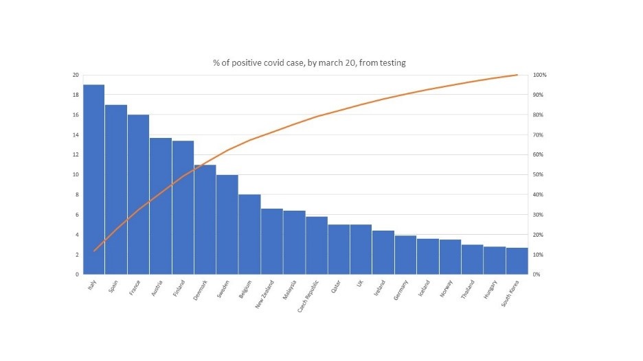
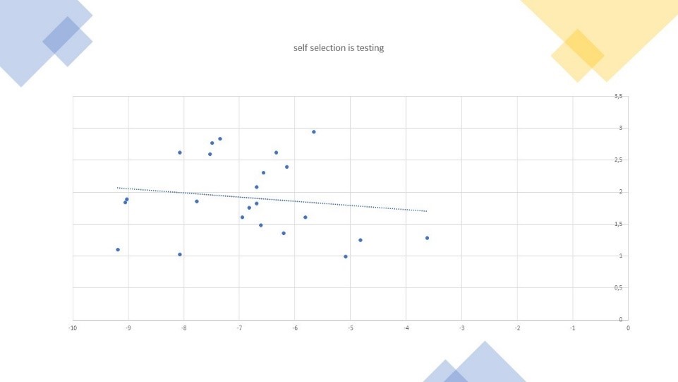
Those figures are likely biased upwards as a large part of tests has been made of people feeling unwell, etc. Indeed, we find a strong link between intensity of tests and positive tests, in the way we expect; that is, more tests lead to lower positive rates. Using those (statistically significant) cross-sectional links, we estimate that selectively leads to up to three times the true average. Otherwise stated, the true infection rate was more in the range of 3% of contamination than 8%, by March 20. This average comes just above 25 days after first deadly cases observed.
Figure 3: Computing the selection bias in population sample tested
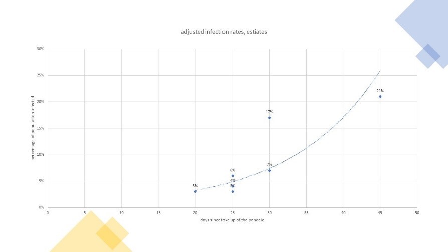
- If one deep dives into population cases: 12-15% after 45-50 days. If we know look deeper at full population, the total number of contagion in the Vo village amounted to just above 3% by Early march, or roughly three weeks after the first casualty in Italy, after all the population got tested, and strict confinements were put in order. At this level, this means that about the true reported number is roughly 8 times, what would have come out if the same process of reporting would have been in place like in the rest of Italy. Furthermore, if \(R_0\) is in the range of 2, and considering the time for contamination, this may mean that, without actions others than own people taking some caring measures as a result of their risk perception of the virus, we should reach close to 12% by March 20, or roughly 45 days after first casualty in the region.
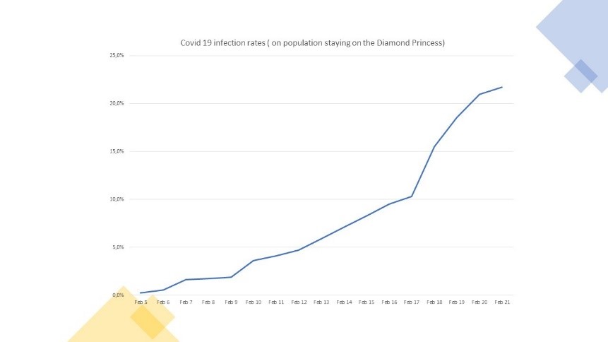
Looking at the Diamond Princess cruise ship, figures were about 17% by February end, or roughly 4 weeks after the first case was spotted and in final, roughly 21% by march 15th, or roughly 50 days after the start of the contamination. This figure is possibly into the high-end, because the cruise has attracted lot of old people (75% of infections came from people older than 60 years old, while typically the share of infected has been more 30-35% in China, South Korea and recent figures released by the CDC in Europe). Correcting for the high propensity of contamination, the figure is about equivalent to a 16-17% contamination effect.
Figure 4: The development of COVID-19 infections on the Diamond Princess cruise ship
- If one performs a deep dive case study on Wuhan: Minimum 3% after 20 days. We finally have leveraged data from Wuhan, to correct for the actual number of cases. In particular, we simulate a model, by which we revert back the infected cases both based on timing of contagion, as well as on a study recently performed by Li and colleagues hat simulates the spatio-temporal dynamics among 375 Chinese cities.5
As the later study still takes the recorded figures as the “official” background figures, we also corrected the figures by considering the estimate of cases by Jan 23, based on our cross-sectional tests by country, and/or by taking more credible figures, arising from a survey of people in Wuhan in terms of how many people they actually knew of being infected, leading for instance to about 3% of the Wuhan population, by early February 2020.6
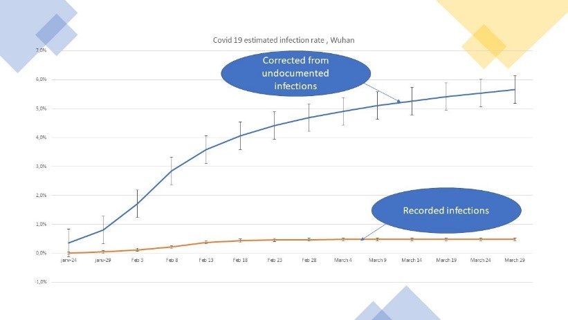
By doing those adjustments, we were able to estimate that by today, close to 6% of the extended population of Wuhan is already infected, despite very severe measures to stop the virus outbreak. The ratio of likely to recorded infections is now close to 10.
Figure 5: Corrected contamination developments in Wuhan
5. Implication for pandemic momentum (-> longer) and fatalities rates (-> in the range of 0.4% for Western Europe countries)
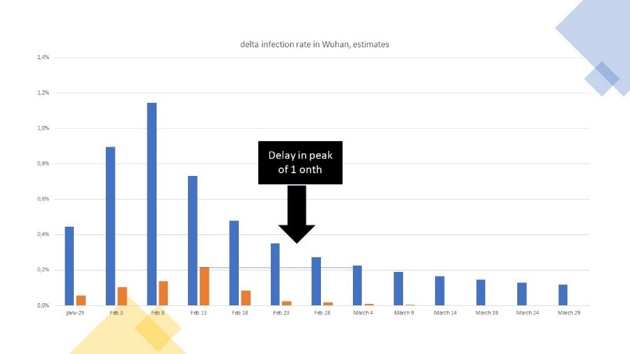
- One first implication of the above is that contamination will build up longer because of those unreported. We take Wuhan as a case example. Based on adapted figures, the same level of contagions, which was recorded as the official peak at Wuhan, in fact happened one month later, during the declining phase of the corrected dynamics of the epidemic. For each period, the number of new cases is higher than the recorded one, leading to an increase in the relative stock of corrected versus recorded contamination.
Figure 6: The dynamics of new cases recorded versus corrected case, Wuhan
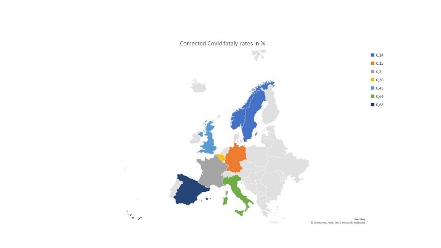
- The second major implication is that the fatality rate is lower than expected. Using an average 20 days from being infected to death, we estimate it to be in the range of 0.45% in Wuhan (if one believes the recorded figures of death casualties). It currently oscillates between 0.14% in Scandinavia to up to 0.65% for the average of Spain and Italy, for an average in Europe of roughly 0.35%. We find fatality rates are higher in countries with older population, larger co-morbidity and with either lower quality of health services and/or not enough critical health capacity. Thus, we expect those figures of fatalities to be higher in countries with older population and poor sanity, and quality of healthcare. This may mean that rest of the world is likely above the European fatality rate.
Figure 7: Adapted fatality rates in Europe
6. New \(R_0\) computations: figure just above 2
What do we infer finally for \(R_0\)? First we estimate from the death rate as a proxy for dynamics of contagion under some strict hypotheses, then we recompute \(R_0\) using new adjusted data. Our hypothesis is that the new \(R_0\) should be slightly lower than some early estimates as early recorded data may under-estimate the pandemics. This is exactly what we find.
\(R_0\) estimated from the death rate
Technically, \(R_0\) is computed from contagion, but if we assume that the fatality rate is more or less constant and that deaths are more or less fully diagnosed with COVID-19 testing, then the dynamics of the death evolution may provide some indications as to how \(R_0\) might converge. Using a 20 days window between contamination and deaths, the average \(R_0\) looks to be in the range of a weighted average of \(R_0=2.2\) (1.7 to 2.8) when doing the computation for about 20 countries.
\(R_0\) estimate from the the amended infected cases
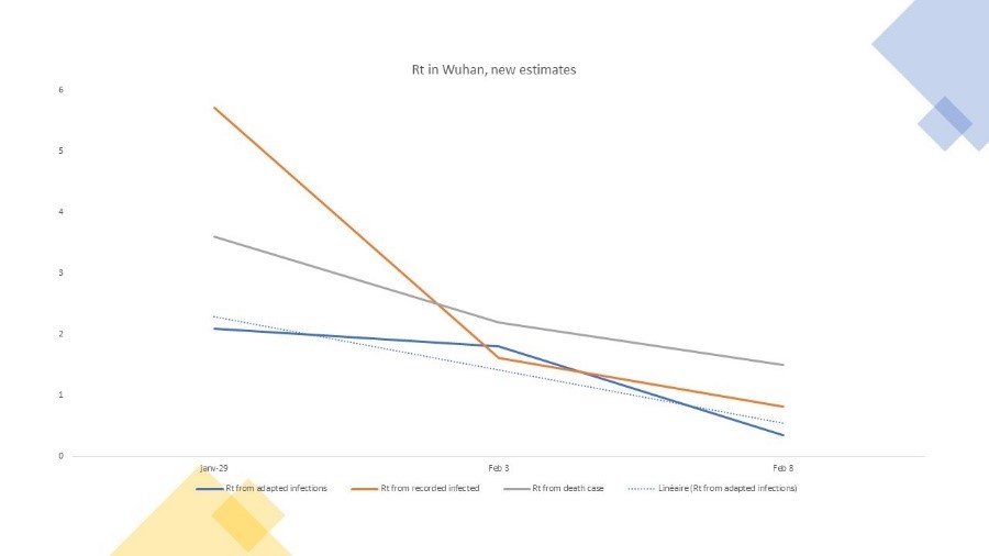
The above \(R_0\) estimates rely on some key constant ratio assumptions. We however can also compute a new \(R_0\), from the amended contagion data, as we now have all cases, and not only the registered cases. We provide this for Wuhan as an example. We compare \(R_0\) from recorded data, then from death rate and then from amended data.
The last one should be ideally the most accurate, and demonstrate a \(R_0\) in the range of 2. The \(R_0\) at the very early days of the outbreak is relatively high from recorded data at more than 5, while the one on death rate is in between the tow other figures, but obviously the death rate has a time lag effect which makes it difficult to compare at same period as the two other estimates.
Figure 8: New estimates of \(R_0\)
7. So what
- A serious pandemic - more than the flu. As to be expected, - and if the adjustments appear to be confirmed - , the dynamics of COVID-19 is more in the range of \(R_0=2\), and a fatality in the range of 0.45%. Applying a natural protective adjustment of the population along the pandemic development, we estimate a risk of contamination at 29% by end of year 2020, and an implied mortality of 1.3 out of 1,000 individuals.
Scaled to the world population, this is a potential of 8.5 million by end of year, and up to 12 million at infinite. The figures tell us that the dynamics of COVID-19 is serious, as this means the pandemic will be at par with the first and/or the second most lethal diseases, such as heart disease or strokes worldwide, but its scope of impact will be much, larger affecting 1 out of 3.5 people.
- We may not relax our efforts both to keep the pandemic at bay, as well as to avoid a second wave. Of course, most of the countries have been taking measures to limit the pandemic. Some have been extreme, like China, or because of its small practical scale, a town like Vo, in Italy, which could test and identify infected people, quarantine them while protecting the population. In general, most countries are taking confining measures, as well as protective measures, some with stricter enforcement rules than others, and/or with much better testing process.
We have rebuilt the model, and are able to show that adding those measures and be very successful fast in executing against them lead to a control of the pandemic, reducing the total contamination to 5.5% of the population by end of year, with an outcome, of 1.6 million fatalities worldwide, or still twice the flu mortality risk. This is because the \(R_0\) of the COVID-19 remains higher than the flu (\(R_0=2\) versus \(R_0=1.3\) for the flu), as is the mortality rate (0.45 % versus lower than 0.1% for the flu).
Figure 9: How (un) successful containment measures make a difference
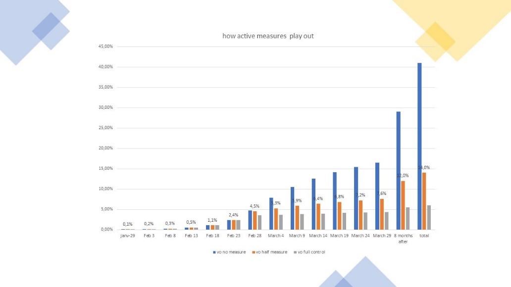
If on top, measures are only followed at 50%, the risk is that the pandemic will reach more than 1 person out of 10 by end of year, and will still put a large burden of fatalities and continued hospitalisation—peak will have passed, but still we might still be running at thirty percent of current capacity to care about COVID-19 risk until end of year.
- There is no way back to normal this year. Last but not least, controlling the disease as done today, clearly shows that there is no back to normal, as from the case of successful stabilisation, say below ten percent of the population infected, the epidemic data might suggest that up to twice the same risk potential as current may reappear within the year. We must structurally prepare against a second wave, and speed up for effective testing and vaccine protection. We are only getting started on the journey.
© Jacques Bughin. Written April 2. Comments more than welcome. All errors are mine. References listed as they are found in the text
-
A fortiori, if asymptomatic cases are less contagious than the other cases. ↩
-
Here are some of the maths. Typically, number of ICU beds in best countries is 0.15-0.20/1,000 population; with 2 per 1,000 fatalities, this is roughly 1 per 1,000 of COVID-19 mortality for 9 months without influence, and if people stay 15 days in hospital for 33% of ICU fatality rate, we are at about 0.17/1,000 ICU beds needs, just filling the supply. High mortality, and/or less supply is a major challenge; in Europe countries like Italy have 3.4 hospital and care beds for 1,000 inhabitants for say much than twice that for Germany, - leading to the crunch of the pandemic in Italy, with one of the oldest population. ↩
-
See, Mizumoto, et al, 2020, Estimating the Asymptomatic Proportion of 2019 Novel Coronavirus onboard the Princess Cruises Ship, MedRvix. ↩
-
See for instance Gorączka koronawirusa, FALA 2 Polska 26-27.03.2020 ↩
-
See Li, et al., 2020; Substantial undocumented infection facilitates the rapid dissemination of novel coronavirus, Science. ↩
-
See Guo, et al., 2020. Psychological Effects of COVID-19 on Hospital Staff: A National Cross-Sectional Survey of China Mainland. SSRN. ↩